LIVE
Redesigning Pavegen.com
Increasing the volume and quality of leads

I led the redesign of Pavegen.com in order to increase the volume of qualified leads that the business was generating. While reducing the number of unqualified enquiries.
My role
Lead designer
Products
Website
Skills
Information Architecture
Stakeholder Alignment
User research & testing
UX design
Product management
Advanced prototyping
Design systems
UX Writing
Timeline
January – February 2025 (part-time)
What's Pavegen?
A technology company that manufactures interactive floor tiles that generate electricity from footsteps.

37
Countries
300+
Projects
1B+
Footsteps captured
Pavegen in 60s
A video I produced to explain Pavegen in under 60 seconds.
Problem
While supporting the sales team, I noticed recurring pain points in their conversations with prospective clients.
After conducting several interviews, it became clear that the website was a key contributor to the problem — and the primary opportunity to address it.
Insights
To increase qualified leads and reduce unqualified leads I determined we needed to focus on resolving the following pain points.
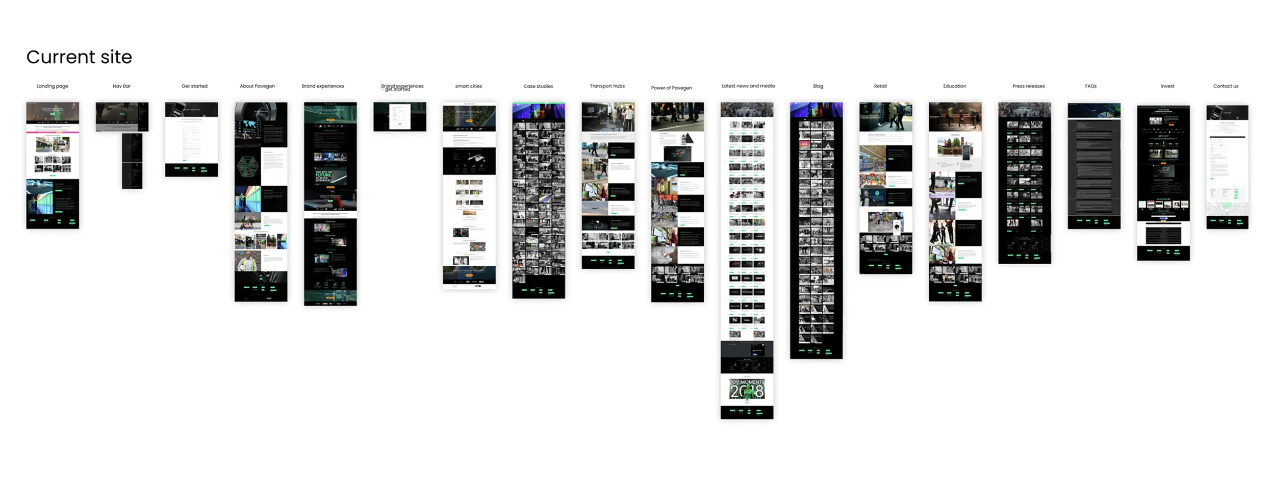
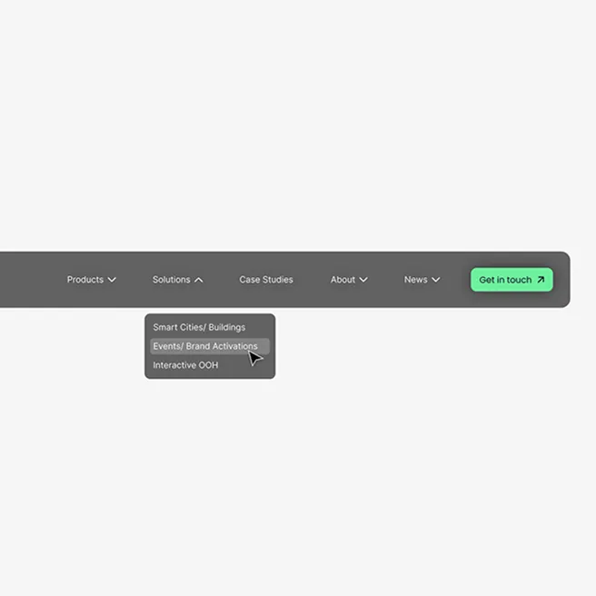
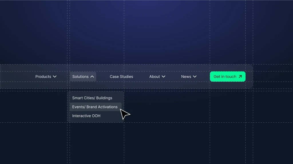
Structure
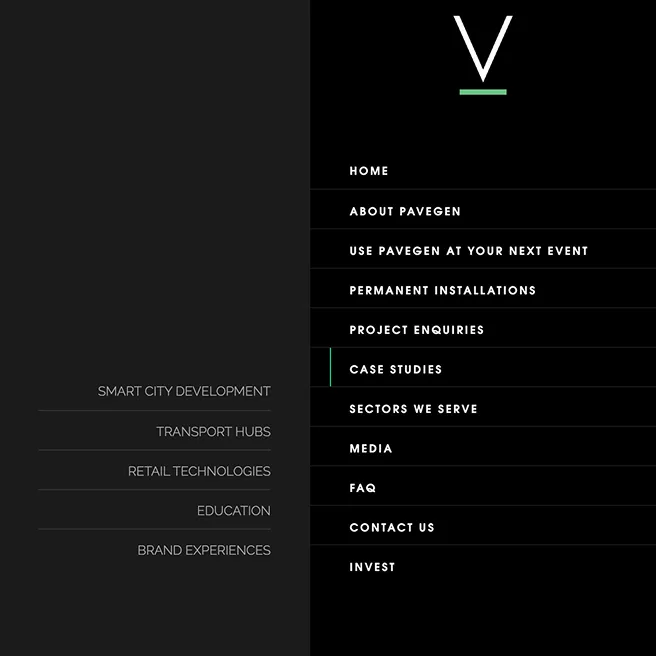
Confusing site architecture
Duplication of information
Content
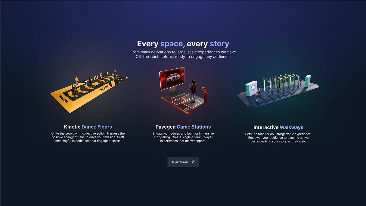
Products and services are unclear
Missing capabilities
Presentation
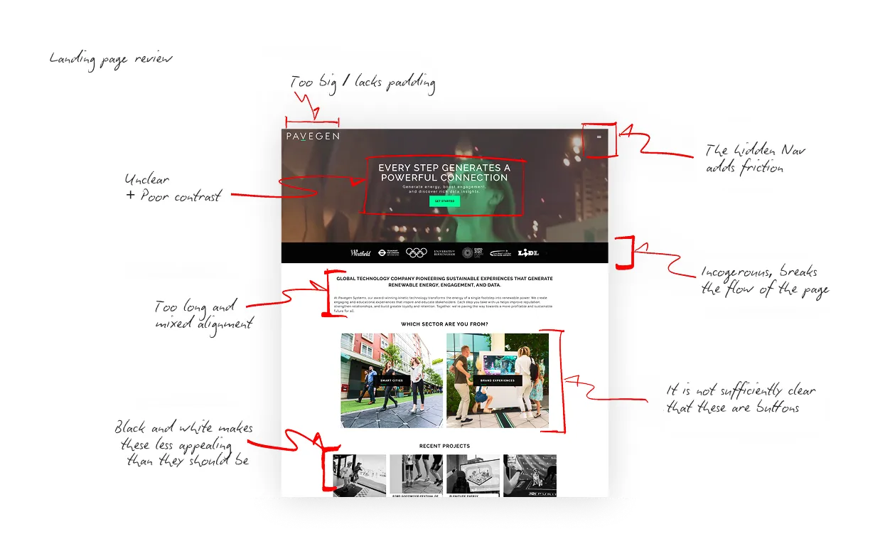
Visual hierarchy not optimised
Lack of clear CTA’s
Too much text
Solution


Structure
I simplified the information architecture and removed duplication.
Before
11 site sections.
Duplication of content.
Confusing structure.
After
6 sections.
Removed duplication.
Simplified categorisation.
Content
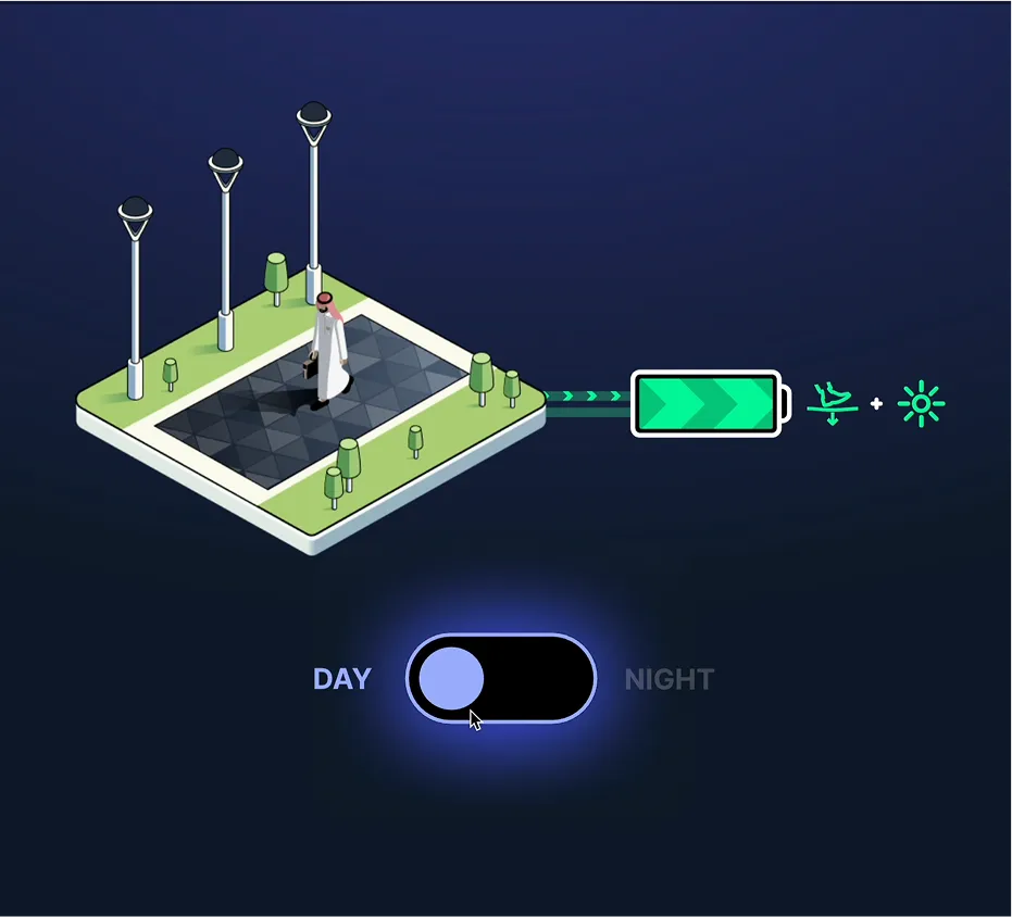
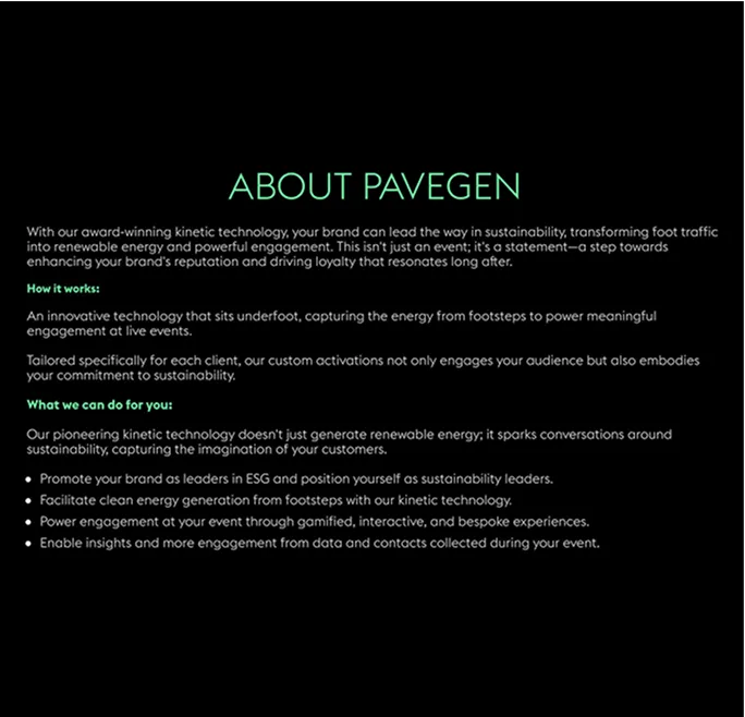
Removing ambiguity by simplifying messaging and adding missing capabilities.
Before
Too much copy.
Too much focus on features not solutions.
Too abstract, not enough visual communication.
After
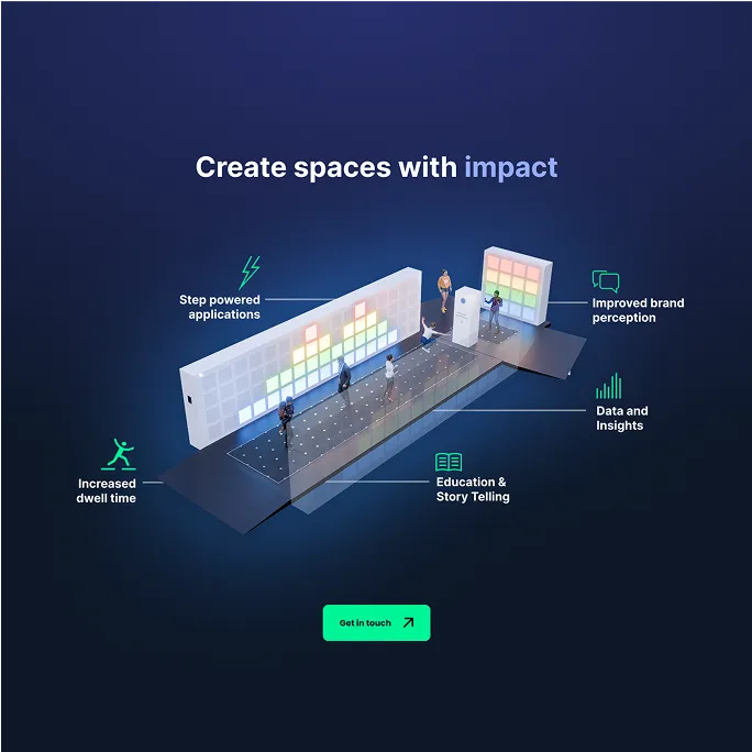
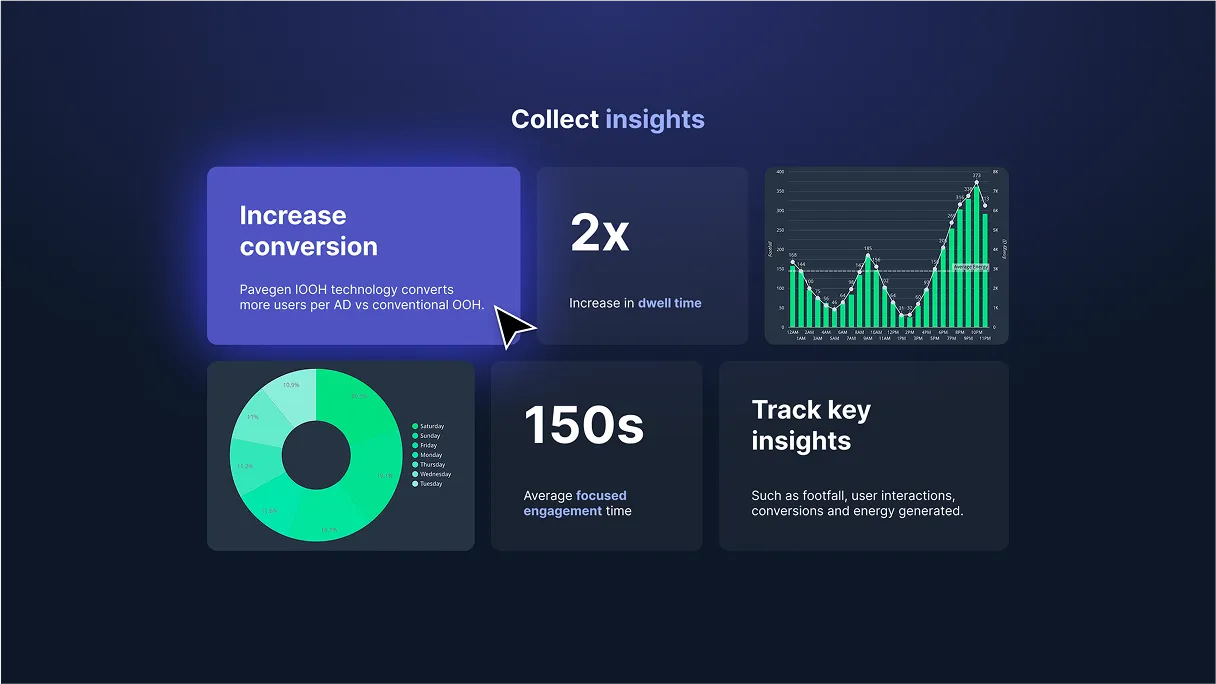
Swapped swaths of text for simple visuals.
Focus on solutions, not features.
Added missing capabilities.

Presentation
Making information more accessible with improved visual hierarchy and focused CTA’s.
Before
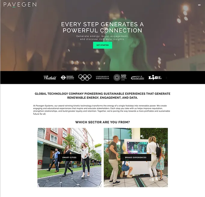
Lack of clear information hierarchy.
Incongruous mix of visual styles.
Sporadic CTAs.
After
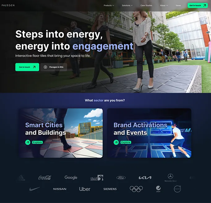
Clear information hierarchy.
Consistent use of visual styles.
Persistent CTAs.


Impact
21% increase in qualified leads
Sales team reported increase in lead quality
14% reduction in unqualified leads
*relative to the previous 3 months period following launch
More projects


© Hugh Johnston 2025